The Challenge
Honch is a B2B data platform that provides B2B sales & marketing data for revenue teams and marketers that enables them to identify and engage with active buyers. The platform provides users with a database of over 200,000 decision makers, allowing them to spend less time prospecting and more time selling.
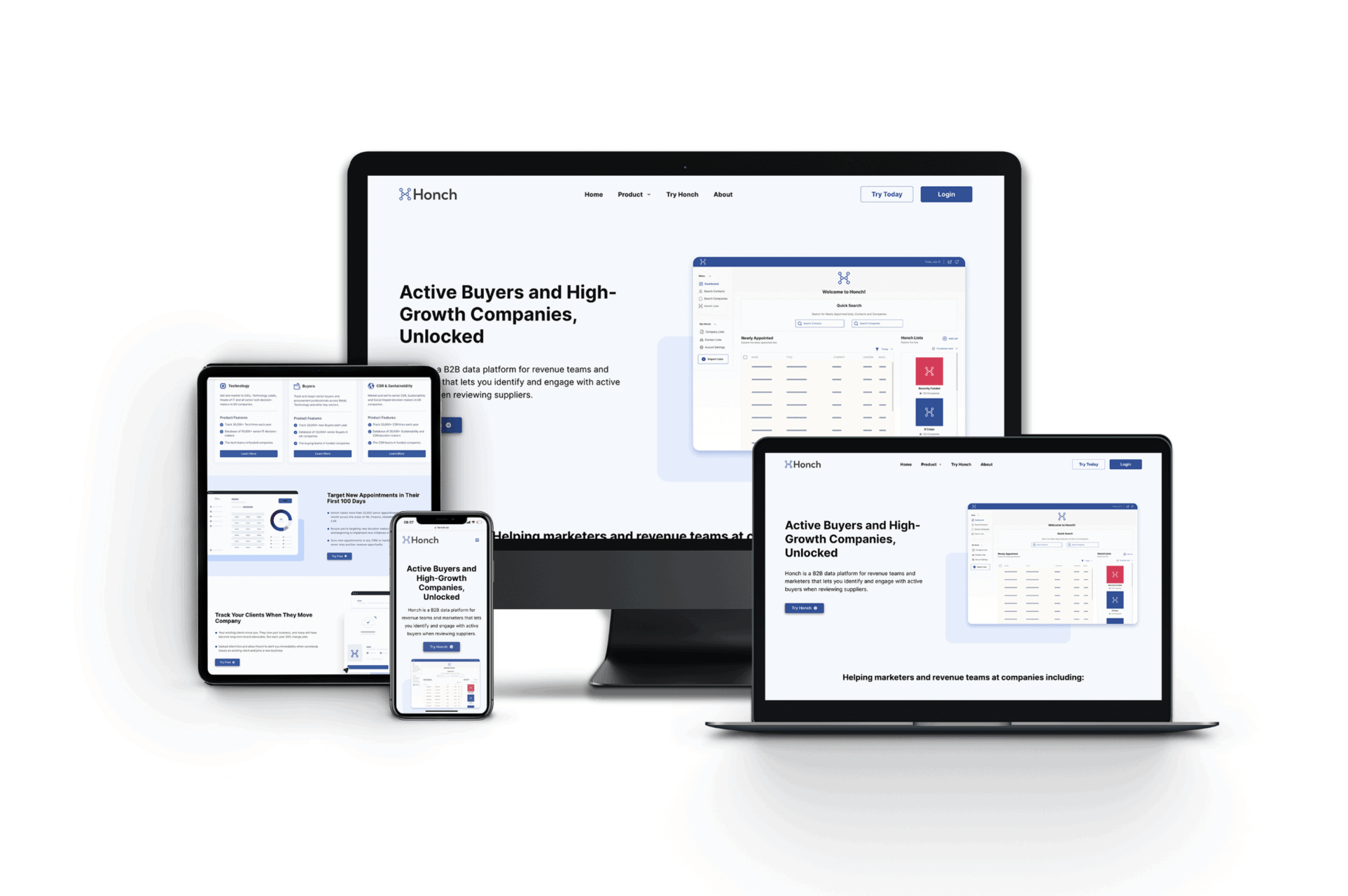
When Honch approached us, they had an existing website but the business had identified several areas for improvement. Neither the language on the site nor the site navigation were clearly conveying what Honch has to offer. For example, they had individual products (Finance, Marketing, HR and more to be created), but the current site didn’t break down these areas into individual sections. By improving the messaging and the site layout, we would be able to provide clarity for the customer and attract the right customers with relevant interests. The user experience and dated design also needed improvements to generate more leads.

The Solution
To address the site’s lack of clarity and UX, we implemented a newly-branded, modern and clear website that optimised the user experience. This design was created based on updated brand guidelines, including a new logo, new colour palette, new design.
These changes created a refreshed look and feel that was designed with the Honch audience in mind. We chose a clear and simple design that made the information easy to digest and resolved Honch’s previous issue with users misunderstanding their service
In terms of content development, we created new page content that provided more clarity about the services on offer and how they benefit the customer. We achieved this by creating copy with B2B sales and marketing professionals in mind, incorporating social proof to demonstrate real results and ultimately drive conversions.
The content creation process also considered SEO requirements to ensure the new site received maximum organic visibility in the search results. To achieve this, we conducted thorough keyword research based on the business’s offering and the B2B data industry. We worked with Honch to select keywords that had high relevance to the business but also spanned both long and short tail keywords.
We also made improvements to the user journey by creating a new navigation system that directs users either towards newsletter sign up or a trial request. We achieved this by ensuring that each audience has a dedicated page on the website that directly relates to their needs. These pages allow users to find highly relevant information, rather than having to scroll to find what they are looking for.
The user experience was further optimised by integrated features such as an email sign up pop up, a contact form and contact information. These features allow users to quickly and easily register their interest in the services and opt in to receive further marketing.
Summary
The newly optimised user journey was designed to allow users to absorb information quickly and make informed decisions about the value of Honch for their business. The new layout and page content also made it clear what Honch has to offer, where previously the offering had been unclear.
The new site provides a clear path to conversion, using CTAs, graphic imagery and copy to present a modern, coherent brand image.
Testimonial
I really can't thank Tom, Tess, Lorena and the rest of the team for everything so far. Since we've started working with The Good Marketer just a few months ago our sales have more than tripled and continue to grow each month. They have surpassed our expectations and really are like an extension of our business, I just wish I had reached out to them sooner! They are always so friendly, understanding and they really know what they're doing when it comes to marketing. In such uncertain times running a business, it's so reassuring having them. Thank you, thank you, thank you for everything and look forward to a long-lasting working relationship!!
Lara CowardThe House Outfit
"We have been delighted with the results that the good marketer have delivered, the ROI has exceeded our expectations very quickly. It is easy to be a little skeptical with digital agencies about the amount of work they are actually doing for you company but The good Marketer has been very transparent and honest about the work they have done. Putting the results they have delivered aside this is what have valued most about this company. I would certainly recommend The good marketer to other companies."
Georgina KnightsEvergreen Direct
"Tom's passion for giving a holistic approach is a breath of fresh air. His ideas are always relevant, accountable and on brand and I trust him to get on with things. He always executes campaigns with a great eye for detail and you can tell he genuinely loves his job. We've been working together for over 5 months and we have seen a good increase in our ROAS. My Gym Wardrobe is looking forward to growing with The Good Marketer, I would certainly recommend working with them."
Jenny SquiresMy Gym Wardrobe
"Tom and his team have surpassed my expectations, always delivering above and beyond, assisting me at the week-end and creating the most beautiful campaign for my coaching company. Since working with Tom, I have seen a great momentum in terms of the amount of new leads being generated and the gorgeous new clients that are being created because of that. Thank you Tom!"
Nancy FlorenceNancy Florence Coaching
"I came across The Good Marketer, when searching for an agency to take over our Facebook and Instagram paid ads.What initially attracted me to the The Good Marketer was the transparent pricing structure. Our Facebook campaign has only been live for a little while, and our revenue has increased by 35%!! I am looking forward to continuing to work with Tom and his agency."
Richard BridsonCovent Garden Aesthetic Clinic
"An excellent agency, driven by Tom Welbourne. First class account management coupled with creative flair and understanding of importance of results. I wouldn't hesitate to recommend The Good Marketer to any client or colleague."
Kent LawsSignature Works
"The guys at The Good Marketer have been a great help. They managed to pull together a lot of activities that I had been passing to multiple freelancers, improve our page rank, improve our ROI on advertising across Google and FB, and make a number of great recommendations to improve the site for Battersea Spanish. Thanks!"
Ben HopeBattersea Spanish
"I'm a small luxury start-up and Tom has been critical in explaining various approaches and strategies on how my brand can build on the Facebook & Instagram platforms to drive awareness and grow my sales as a result.Tom’s knowledge and know-how has been invaluable in setting up my digital campaigns.You certainly feel you are working with the experts, but the approachable and personal manner makes it even more of a pleasure to work with. I would certainly recommend working with them and looking forward to working together in the future as my business grows."
Olga GuessBoroveic
Previous
Next
")
